We all can find thousand reasons why we like to travel. Some are enthusiast about diverse culture. Some are interested into different food and exotic feeling. Some go traveling mainly for relax.
For past years, I have been using Expedia site to research and get flight tickets or book a hotel. As a frequent traveler, I always get the news or deals from Expedia. However, one of the biggest mistakes I found is while they promote the mobile sales by giving customers discount on mobile booking, the app remains the same issues for years. Alternatively, I have to use other app for booking.
The mobile app travel market takes possession of the majority of the market share. Many competitors like Kayak, TripAdvisor, Skyscanner and others want to expand market share. With this insight, I started this exciting redesign project of Expedia app.

Expedia Redesign:Penetrate Into New Segmentation
Expedia is an excellent site and app to research and reserve air ticket and other travel package services. Evaluating the webpage and the mobile app, I found lots of disconnections between them. The app has a slipshod design.Its usability and functionality is comparatively worse. If the company couldn’t identify and modify these issues, it is going to exacerbate many of the problems that users experience. Essentially, to enhance the visibility and flexibility, proving sufficient ticket information, preference and reasonable filter options, ensures users to have positive experiences when they are using the products or accessing the services.
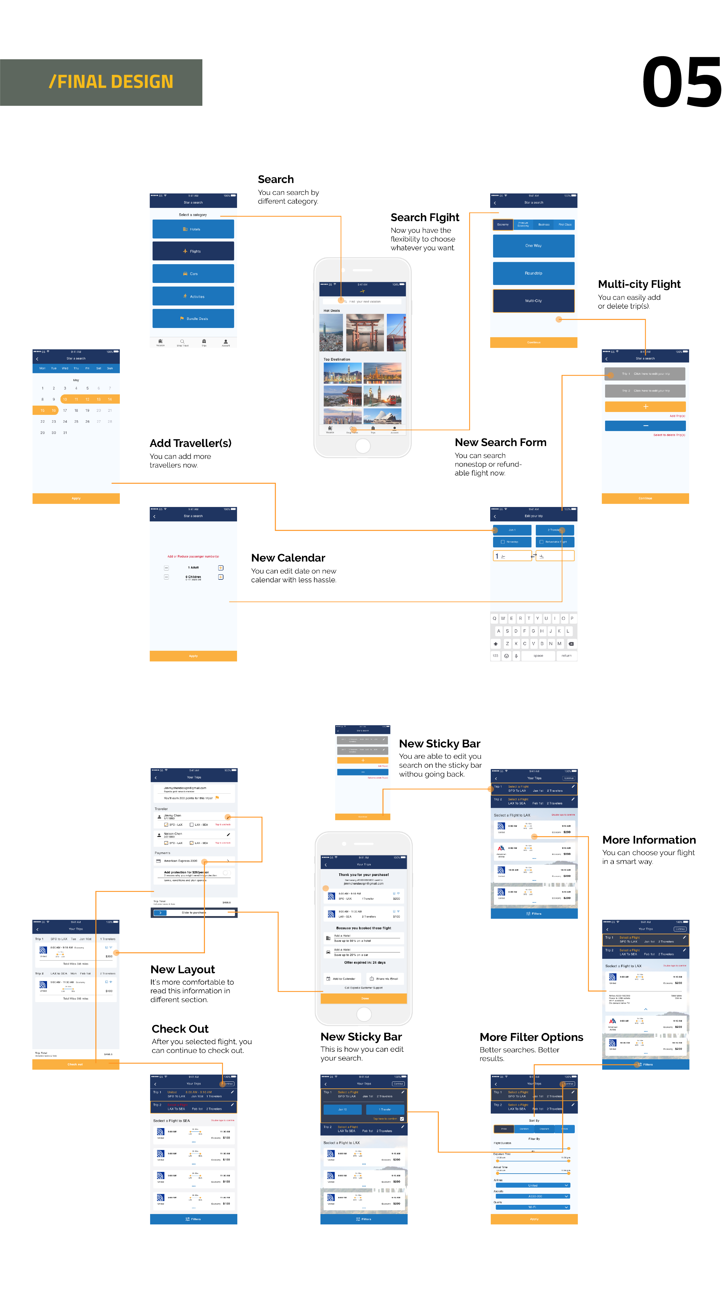
My goal is to mitigate user’s frustration and antipathy of using the app and design a sensible interface to delight and attractive more users. Optimization of the ticket booking section provides useful information and graphic elements such as duration time, layover time and airplane features. Also, adding airline class selection and embellishing filter, which includes options of airline company, airplane type, and flight quality, is of benefit to different customers’ needs.
Smartphones are gradually playing an important role in modern life. They entertain us, alleviate our stress level, and ameliorate our productivity. Shift in the U.S. consumer habits has resulted in huge experience consumptions through smartphones. A user-friendly app and the penetration into more user segments are essential to the success of a service on mobile platform.
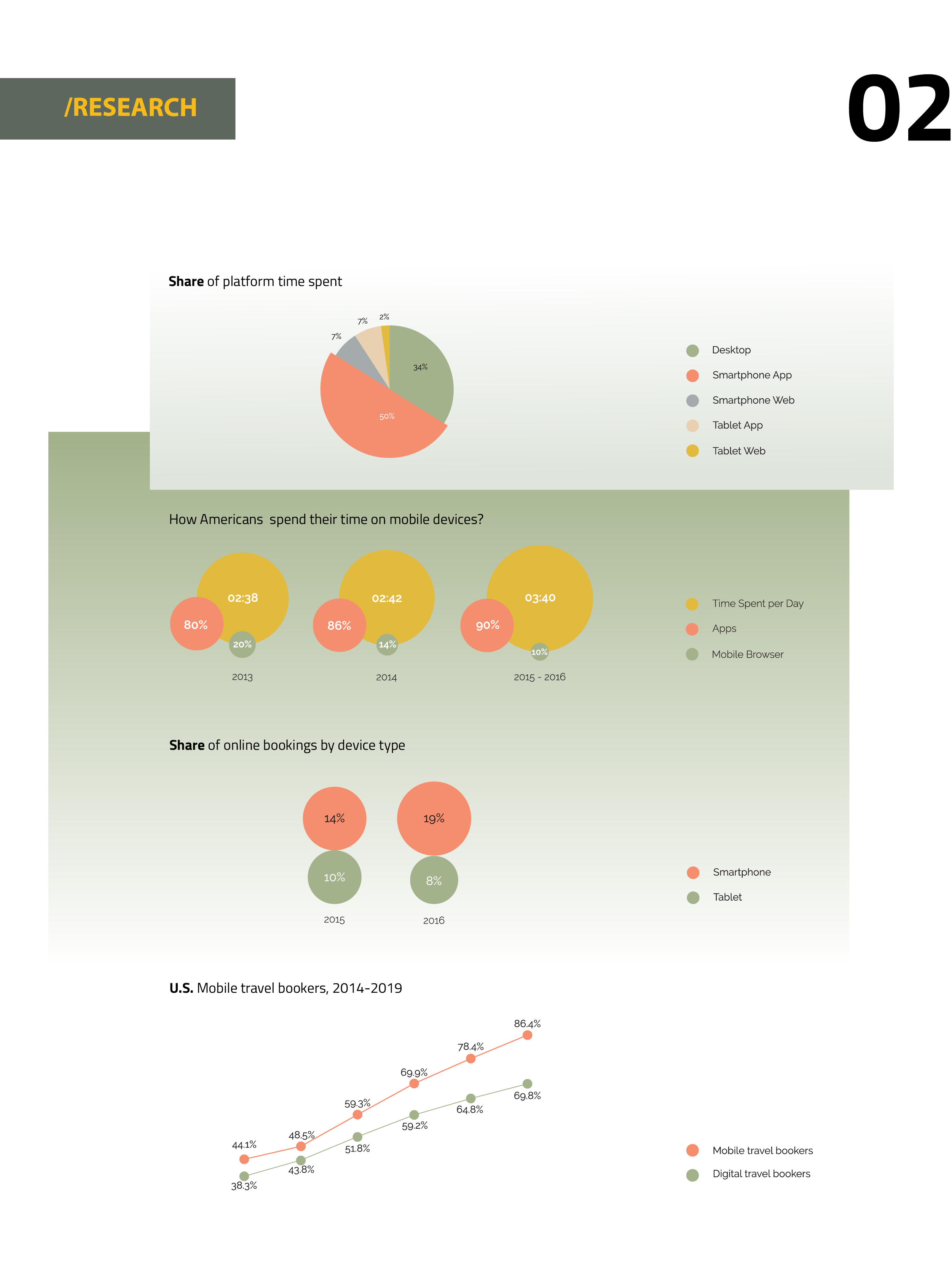
Research shows how attached we are to the devices these days. In a study, a typical cellphone user touches his or her cellphone 2,617 times everyday. Extreme cellphone users, the top 10%, touch their phones more than 5,400 times daily. This study also shows that average users spend 145 minutes on their cellphones and engage in 76 cellphone sessions per day.
A report from Fortune found that, in the U.S., consumer spending has undergone a remarkable shift in the past years: people are spending less on durable goods. But they are spending more on experience consumption, which includes travel, recreation and eating out. Such spending accounts for over 20% of total household consumption.According to eMarketer’s latest estimates of digital and travel research and booking, in 2016, 51.8% of travelers book trips via mobile devices.
For an airline ticket booking app, the exclusion of any customer group would not be wise. That is the app should service both economy and first/business class travelers. As Worldwide Data indicated, despite 90% of all aviation traveling is contributed by economy-class travelers, there are 9% of business-class and 1% of first-class travelers. The business and first class cabin still contain a significant amount of travelers.
As the preferred shopping method for smartphone users is via a shopping app, a user-friendly app is essential. Studies have proved that users care about how they receive information and make interactions through their smartphone screens. 67% of smartphone users say they are more likely to purchase from a business’ mobile- friendly site, while 61% say they would most likely to leave a site that wasn’t optimized for mobile devices.
With the population of mobile booking travelers continues to expand, travel booking on mobile devices will become more popular over time. Sales of travel products and services on mobile devices are likely to increase simultaneously. However, not all travel booking services can be successful. Penetration into all segments of users helps expands the market. The improvement of user experience for airline ticket bookings apps, on the other hand, is the key factor that retains users.
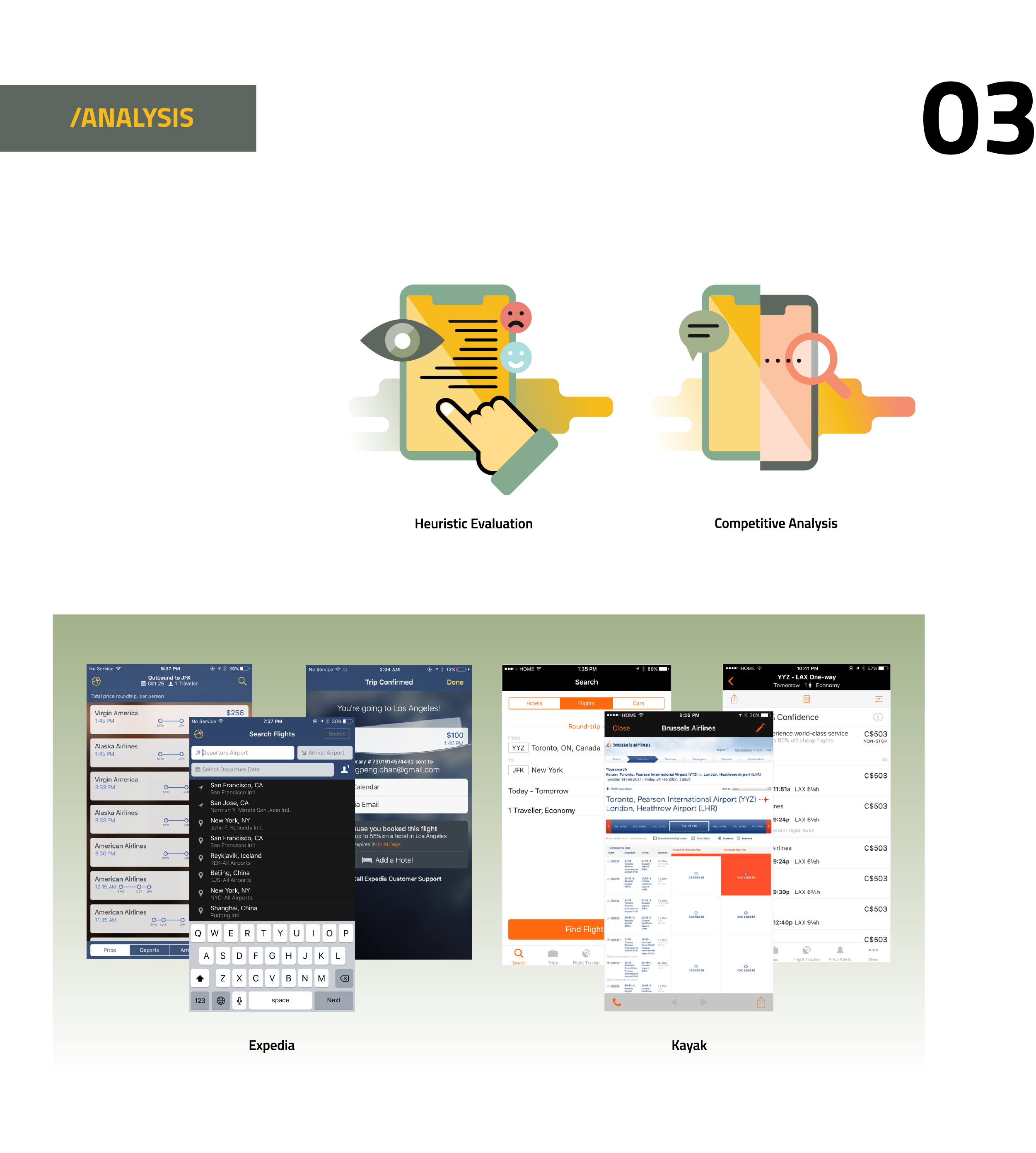
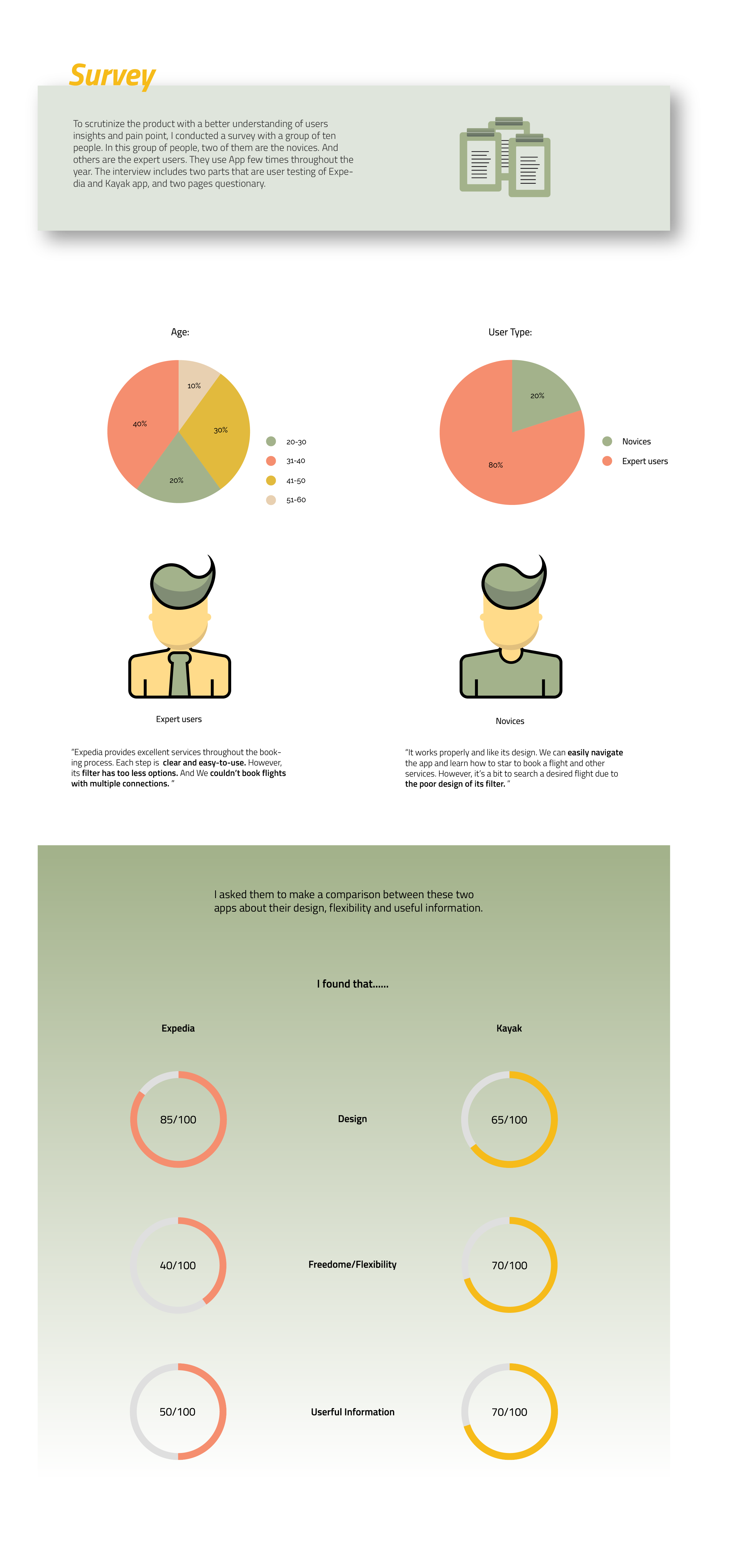
In order to understand the performance of Expedia app, I conducted a detailed Heuristic analysis to evaluate its function and design, and performed an analysis of its competitor’s app – Kayak to identify the differences between them and to aware of the components that audience concerns.
After the experiment, I gained some understanding of each app. Expedia is a multi-functional travel booking App. Many useful features are included in the original design. Its design is recognizable because its visual components are consistent throughout the App. Color and font selections are distinguished from other sites, which is helpful for retaining brand recognition. Also, it is easy to use and navigate. Users receive instructions and alerts when errors happen.
Overall, Expedia and Kayak, both have a minimalist style. The layout and design are organized. All the provided information is readable and understandable. However, Kayak gives users more flexibility and freedom such as giving more options and suggestion for a trip and having a completed filter. These options help user instantly get the result they desire. Also, on the result page, Kayak has more quality information like duration time and stopover counts. Even users can know more detail information about the availability of power outlet, Wi-Fi, entertainment system and layover time.
Opportunities Identified
1. Redesigning the staff pick section and search bar make users easy-to-use and easy-to-access.
2. The original design is visually easy to read and clear. Staying consistent with its visual style, it helps customers to recognize it.
3. The filter needs to be optimized. It should encompasses options of airline companies, and aircrafts. Also, Cabin options and multiple connections booking should be included. It will not only accelerates the process of booking but also helps customers to locate the result efficiently.
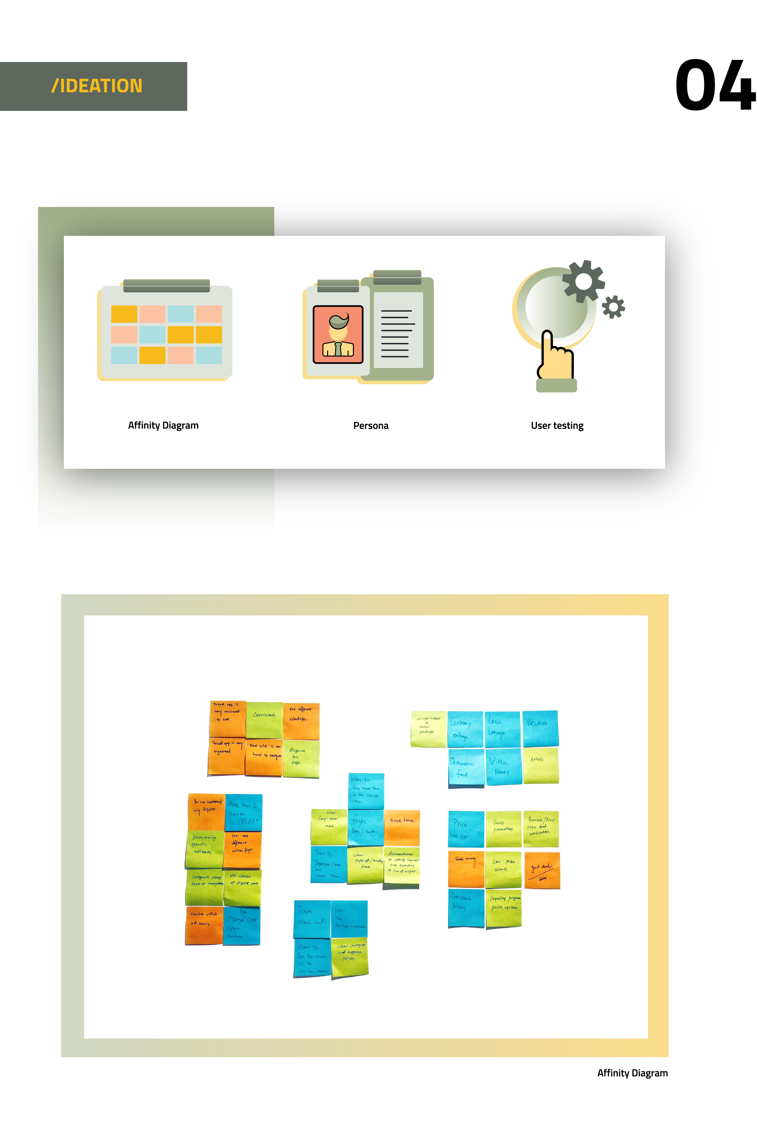
Just right before I started to develop my project, I invited three friends to participate in this exercise. I seek to know the answer to this question: what’s the reasons why they choose to use travel booking app to book airticket over other methods? Based upon the similarity of these ideas, I classified them into five different groups. I summarized the key points below.
– Traveling booking app is very convenient and organized.
– It shows all air ticket information. Users can make comparison easily with price, time, and other.
– Everyone can leave a review. Users can make a choice wisely.
– It saves time and provides good customer service. Users can make change within 24 hours.
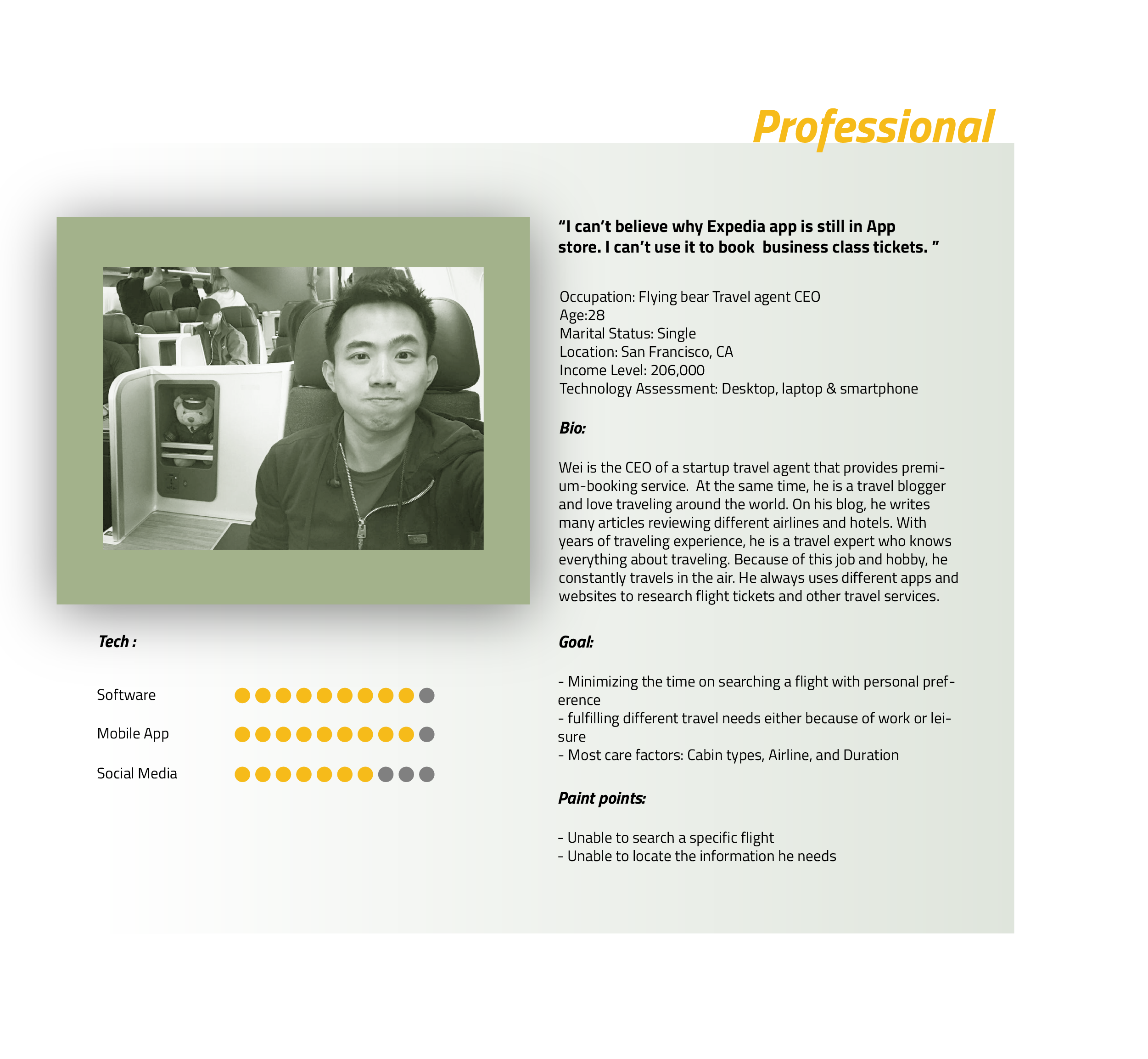
After I interviewed many, I filtered out users who are neither travel expert nor the people who consider to have an exclusive service for their trips and determined my target audiences. I created one distinctive persona based on my research. This typical example represent one target users – “professional/travel expert”.
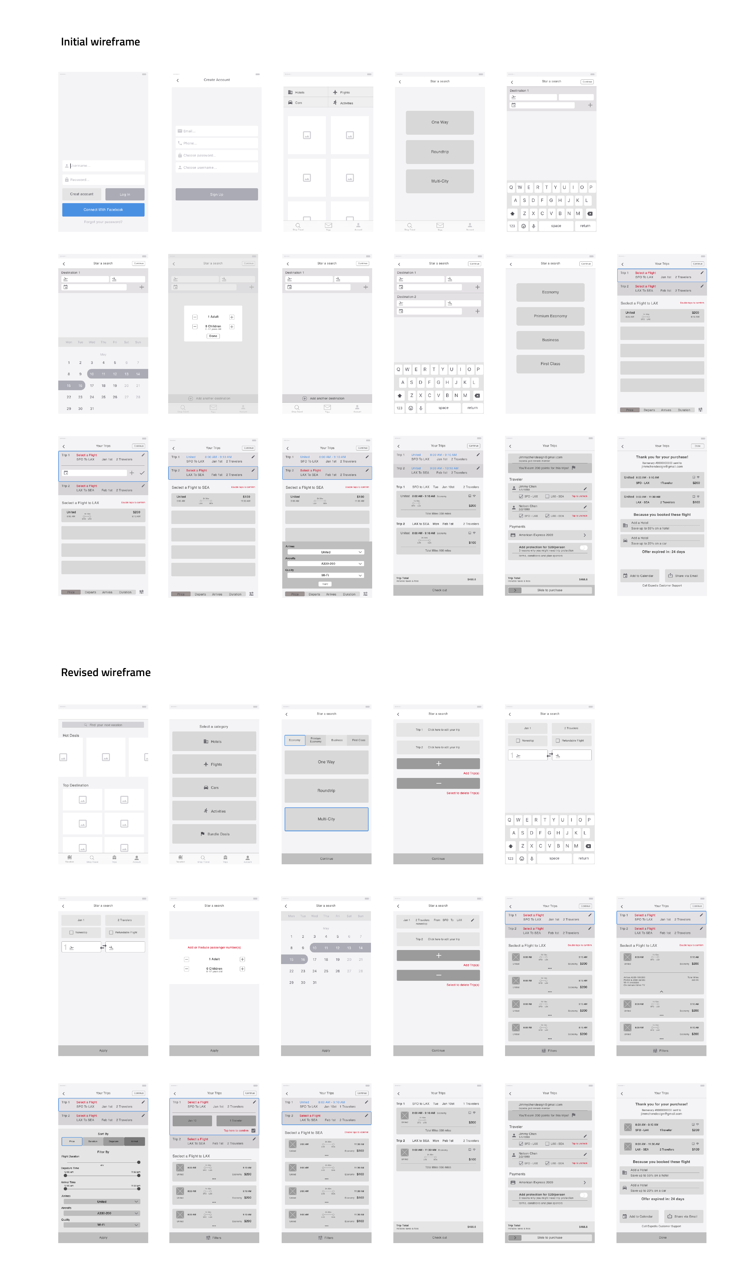
I created wireframe prototype and conducted a user testing session with four users and asked them three questions: What do they think about the design? Does the filter options make sense to them? And do they have any other suggestions?
Users love the new option menu. Compared with the new design, they feel that its original design is a bit confusing when users select one way or roundtrip ticket. They think the new trip option menu are helpful and considerable. They also agree that adding more filter options will accelerate the process of finding a good deal or the best flight that they want. One suggestion they advise me is to add the edit feature at the flight result page, so they don’t have to go back to the previous step to update the information if they change their mind. Also, users have a positive feedback on the new check out page. They think the new design is easy-to-read and organized.